
England Netball (EN) is excited to introduce our new look, creating a fresh, confident and friendly brand identity with a new logo, to support the launch of EN’s new 10-year ‘Adventure Strategy’.
Where it all began
Conversations surrounding EN’s re-brand began after the Vitality Roses won gold at the Commonwealth Games in 2018. This moment signified a fantastic point to utilise the sport’s momentum and build a stronger platform and identity for EN across the world.
In March 2019, EN conducted research with several different groups of people inside and outside of the Netball Family to help develop our new identity and how it clothes us for the next decade.
We asked people to take a good look at our logo and identity and tell us what it meant to them.
The rebrand brief
Once we carried out the research and collated the results, we thought very hard about what we wanted our new brand identity to be and how we wanted to be portrayed internally and externally.
We wanted to be different and stand out from other governing bodies and sporting organisations. We wanted to have a premium look and feel, whilst ensuring we appeal to all ages, and be brave and bold, whilst being true to ourselves.
When COVID-19 came along we pressed paused, instead investing all our time and efforts in protecting the sport at all levels of the game during the pandemic.
But now we are ready to launch our fresh new look, alongside unveiling our exciting ‘Adventure Strategy’ – a 10-year plan with the ambition to accelerate the growth and development of the sport at every level.
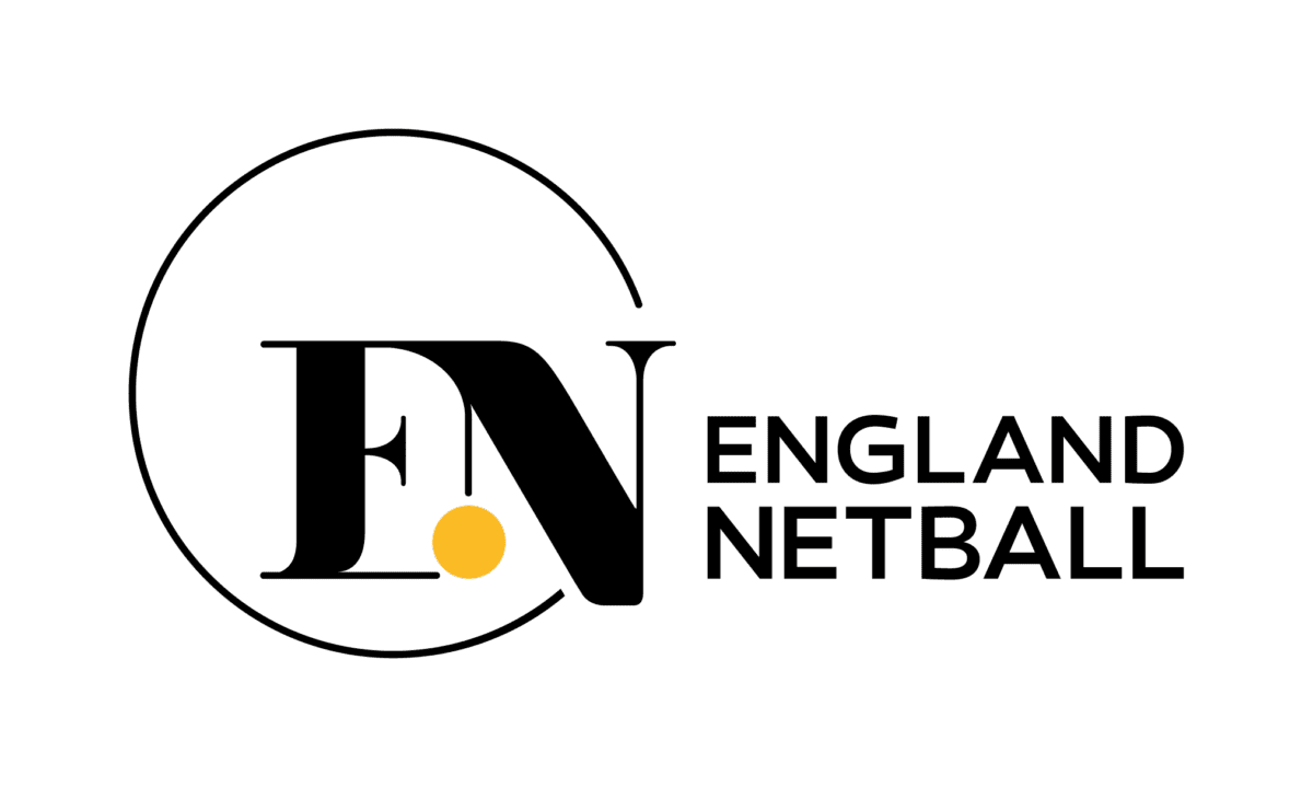
The logo
We are a game for life for so many and a world-leading game at that. Our brand identity reflects our role, place and 10-year ‘Adventure Strategy’ ambition.
We believe our new logo is fresh, confident, and friendly.
![]()
Our identity moves us beyond a traditional governing body of a world of red, white and blue. Our inner dot shows us to be agile and flexible and introduces us to different experiences, through colour.
The inner dot is personal. We don’t define what it is, we allow you to interpret. It could be a ball; it could be a playing experience. For those working for EN, it could be their contribution to our game and organisation. Visually it sits off centre reflecting our place in the lives of our community.
As endless innovators, the base stroke of the N steps out beyond the ring, into a life wider than our sport name suggests.
The logo in a circle represents the individual embraced by the netball community and, as guardians of our sport, it symbolises our keep safe ring.
The logo spells out the word ONE. We are ONE Netball Family.
A New EN Identity
To further embody our fresh and modern look and more widely support the new ‘Adventure Strategy’, we have refreshed our website and social media channels.
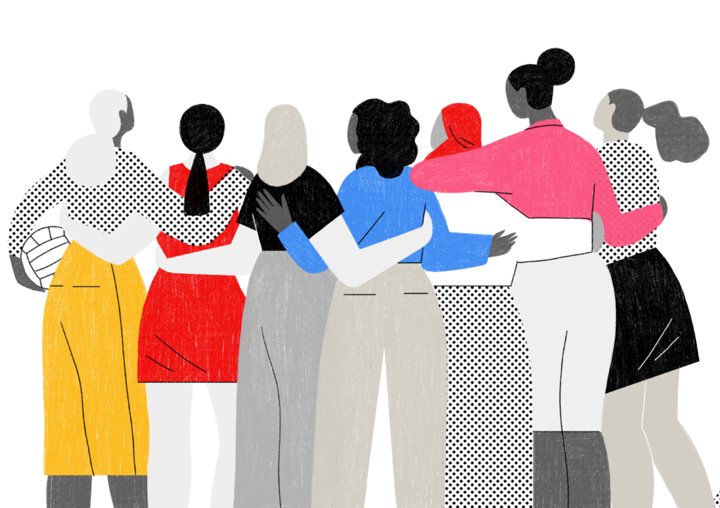
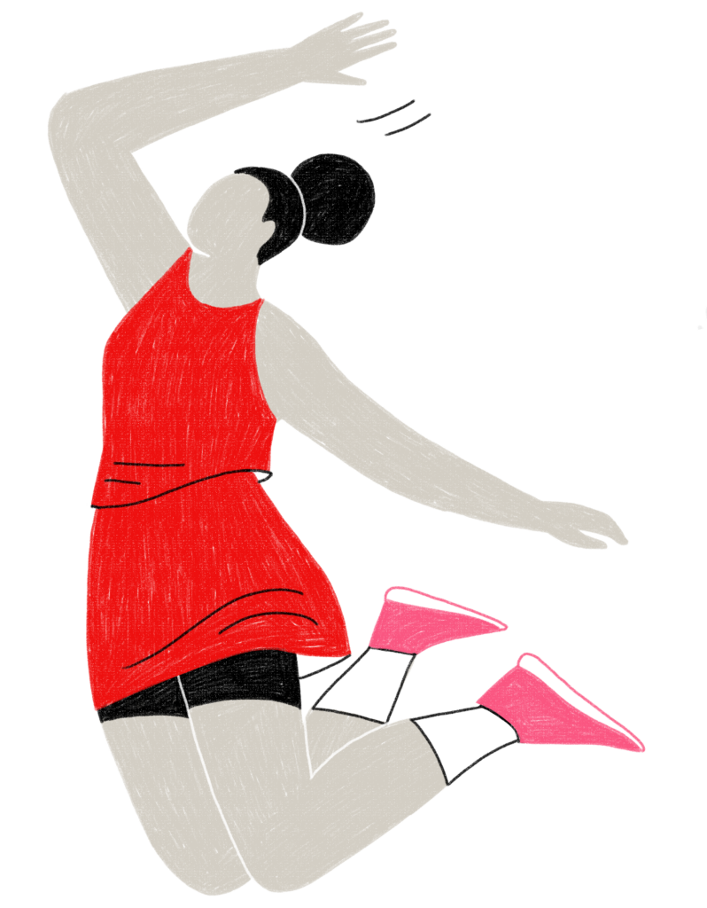
Across all platforms, EN now has a fresh look and feel, using fun tapestries and personal illustrations to embody the community feel and inclusivity that’s central to our sport.

We commissioned an illustrator from New York called Abbey Lossing to produce our very own EN illustrations.
We believe the illustrations add another layer of identity, softening images and making us more accessible.
The colours in the illustrations are from our EN colour palette, adding fun and a playful element.
The illustrations can be used alone or overlayed on imagery and they are a good way of linking brand and strategy as each destination has its own illustration.
Colour Palette
Our colour palette has shifted to a clean monochromatic aesthetic. However, we are colourful too when we excite over our programmes, partners and offers which express themselves in different hues.

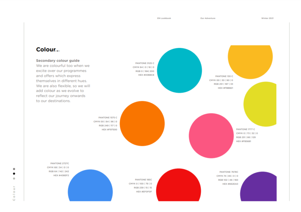
We are also flexible, so we will add colour as we evolve to reflect our journey onwards to our destinations.
The Roses logo
The Roses logo remains the same, we haven’t changed that. However, when we (EN) talk about the Roses we will introduce the colour red into our logo.

Clothed with our new brand identity, we want to create moments, events and experiences that create a sense of belonging and give people a feeling that they are part of something much bigger than themselves.
EN’s new adventure is here, and we can’t wait to start this journey, together.
.jpg?v=638973315461827459 "NWYC 2025 JM Karen Cartwright (1)")


